8. Color Schemes
The developer should avoid setting color schemes or palettes manually. The ELT project includes in their guideles a set of color schemes that may change in the future; so in order to make every application adaptable to future color schemes, these are provided as configuration files in the system.
A particular color scheme configuration in CUT is one configuration files with the extension
.color. The format of these files is an INI based file, that follows the same format as
KDE to specify their color palette.
Nonetheless, the developer should not interact with these files. Instead, two artefacts are available to the developer to access the palettes.
8.1. QPalette
A Qt application when started will read the XDG_CURRENT_DESKTOP environment variable to determined where it should get its color palette from. From the desktop environment configuration entries will get the colors, and create a QPalette object and set it as the Application wide palette object.
QPalette is a data class in Qt. This means that it only contains data, and is not a QObject.
The QPalette separates the colors into three groups (ColorGroup)
8.1.1. ColorGroups
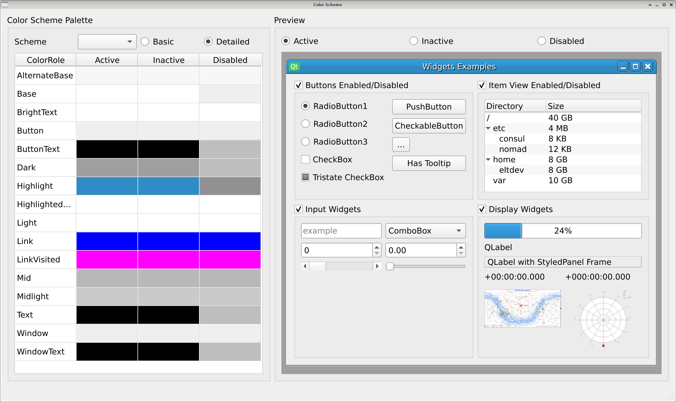
- Active
When a window is selected, this is the color palette applied to it. It is the most used palette.
- Inactive
When the window looses focus, the application detects this, and applies this color palette. Normally is looks very similar to Active, except for the window title. Due to this particularity this ColorGroup is only visible when using QMdiArea, the only Widget that creates window titles
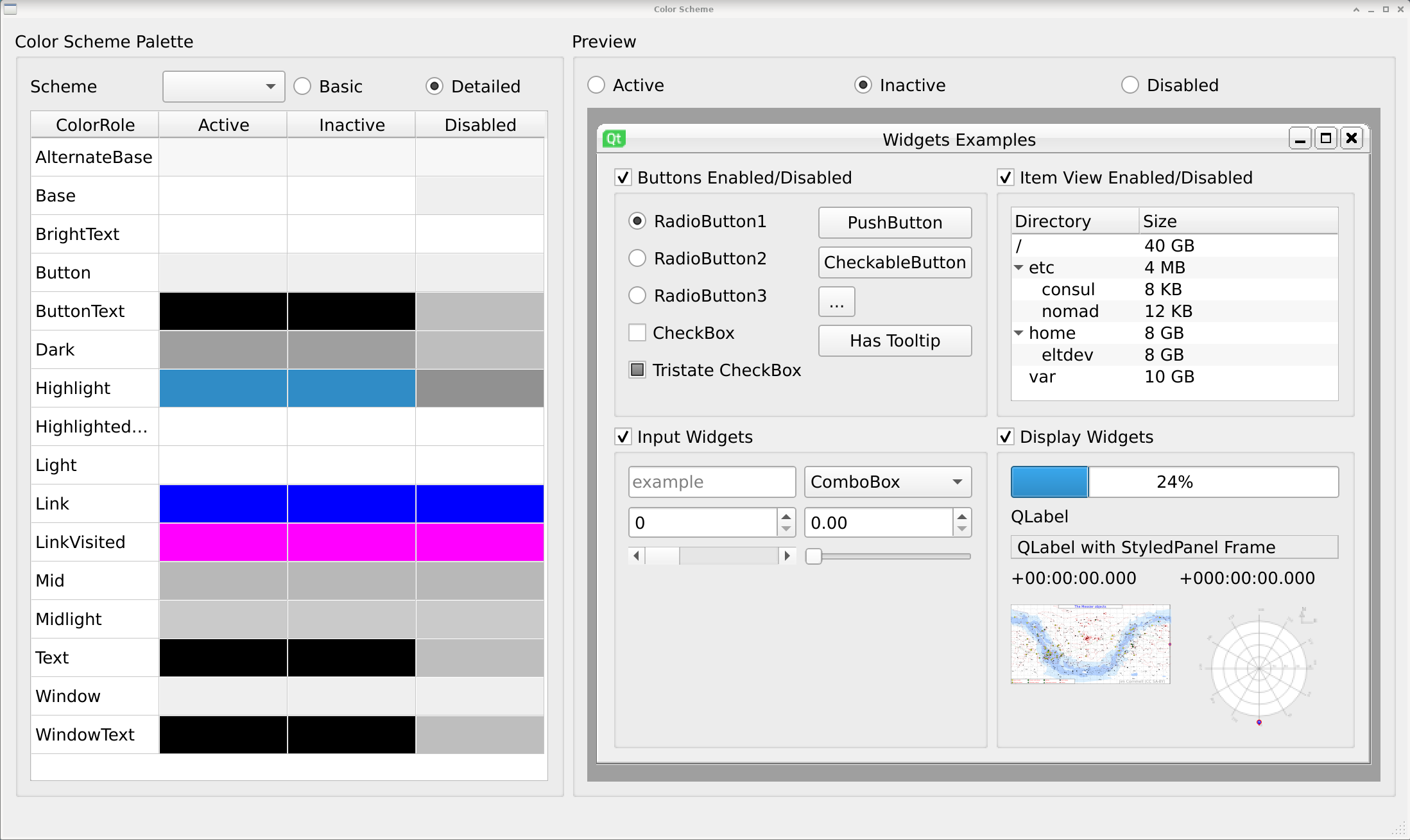
Tip
Window decoration under Linux is responsability of the Window Manager, a separate application provided by the Desktop Environment. Though not recommended, if you were to create a window-less application, it is recommended that accent colors are respected for the window title, otherwise a user will not know when the application has lost focus.
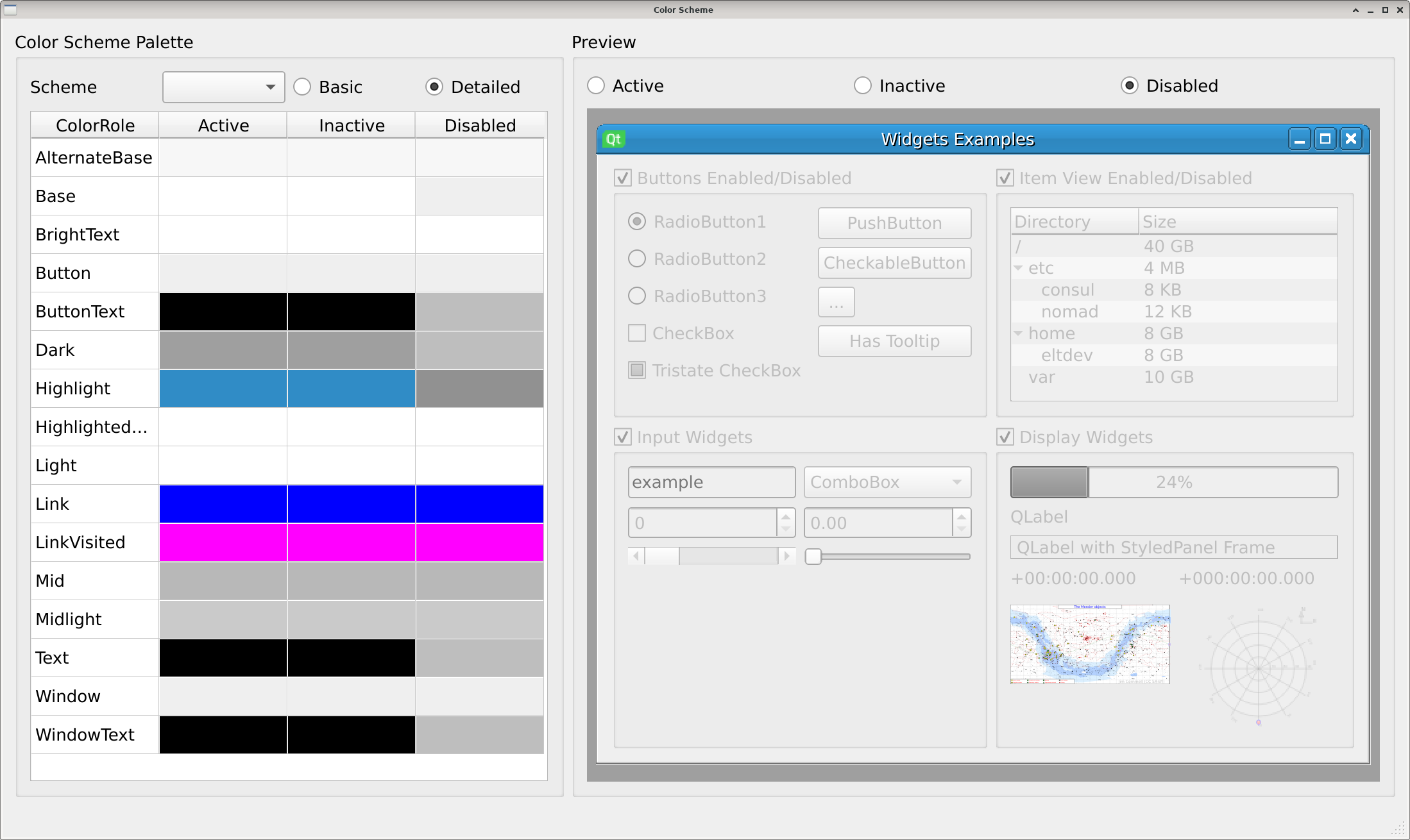
- Disabled
Developer can mark widgets (and their children) as disabled. This cuts interaction with widgets, and presents the widgets as gray or a lighter color. This communicates to the user that those widgets are no longer available. The colors uses for widgets come from the Disabled ColorGroup.
8.1.2. ColorRoles
The colors (ColorRole) offered by each Color Group are the following ones:
- Window
This is the color used for the background of the application. In the examples above is color similar to white. Most of the application and dialogs will use this color as background. An important thing to notice is that widgets will only draw over their borders and will not paint their background. QLabel for example, only draws text over the background of the widget.
- WindowText
This is the foreground color of the Window color. Most colors come in pairs. One represents background (Window), and another foreground (WindowText). This allows to implement the necessary contrast when creating QPalettes.

Tip
Color schemes from CUT already consider contrast.
- Base
Certain widgets implies an editable area or dynamic data presentation by using a different background color. QLineEdit and QTreeWidget use Base as their background color.
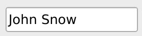
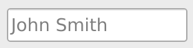
- Text
If Base is the background, Text is used to render text foreground. Please refer to the figure below to see how a QLineEdit uses as background color Base, and Text to render fonts.
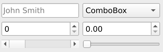
- PlaceholderText
User by QLineEdit as example text color. In the figure below a QLineEdit uses PlaceholderText color to render examples.
- Button
ColorRole used to identify the color for Buttons background. Other widgets may use it as well, such as the ComboBox.
- ButtonText
Foreground color of the pair Button, ButtonText. Used to render fonts over a button. In the figure below, both the Button and ButtonText roles are used.

- Dark, Mid, Midlight and Light
Are roles used to create a sense of depth in the GUI. Their are used in QHorizontalSlider, QScrollBar, to “sink” part of their representation, and “raise” the draggable part of the widget. Similarly, Tables, and Tree widgets use them to render separation lines.
In the figure below: A QLineEdit, QComboBox, QSpinBox and QDoubleSpinBox all use the same color Mid to render a border line that indicates where the widgets area starts. Dark is used to render the triangle that indicates that interaction is posible. The QScrollBar (bottom left) uses Mid for its sunken section of the widget, over which the draggable components slides. The QHorizontalSlider (bottom right) uses Dark to render an inset-rail, over which the draggable component is rendered with Light.
- ToolTipBase
Background color for tooltips.
- ToolTipText
Text color for tooltips.
- Highlight
When selecting text in a QTextEdit widget, or selecting cells in a QTableWidget this color is used to draw the background. This ColoRole provide high contrast against Base and HightlightText.
- HighlightText
Color of the font when selecting text or cells. Hight contrast from both Highlight and Text is provided by this ColorRole.

All colors are accesible via the QPalette color() method.
#include <QPalette>
#include <QColor>

// ...

void AWidget::methodInAWidget(){
    // Request color by Group and Role
    QColor color = this->palette().color(QPalette::Active, QPalette::WindowText);
    // Request color of the current Group (most used method)
    QColor color2 = this->palette().color QPalette::WindowText);
}
from PySide2.QtCore import QColor
from PySide2.QtWidgets import QPalette
from PySide2.QtWidgets import QWidget

// ...

class AWidget(QWidget):

    # ...

    def method_in_a_widget(self):
        # Request color by Group and Role
        color = self.palette().color(QPalette.Active, QPalette.WindowText);
        # Request color of the current Group (most used method)
        color2 = self.palette().color(QPalette.WindowText);
    }
8.2. QeColorsModel
A model based on QStandardItemModel which list all color scheme found in the system. It looks for color schemes in the following directories and stores their QPalettes in memory for easy retrieval.
/usr/share/color-schemes/elt/cut/resource/cut/color-schemes$INTROOT/resource/cut/color-schemes