5 REFERENCE
This section provides the detailed description of the Panel Editor functions.
Not implemented functions are still visible but the associated widget is disabled.
5.1 WIDGETS Window
This window, which initially appears beside the main window, allows the user to select one of the basic widgets supported by the panel editor : in this way the user can `iconize' the main window and work only with this one.
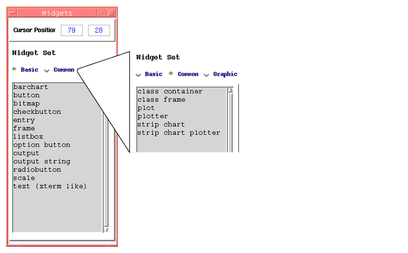
It contains the following sets of widgets :
�
Basic Widgets - These are the basic widget used by the panel editor : these widgets differ from the standard Tk widgets because they have a reduced number of widget configuration options and implement additional methods in order to fulfil the VLT Look & Feel.
�
Common Widgets - These widgets are typically directly implemented in itk and provide specific `high-level' funtionalities.
Who has developed a widget of common interest can submit the new widgets to the responsible of the VLT User Interface to include them into the library.
�
Graphic Widgets - These are not real widgets but they are added to the canvas as "graphic elements" : for the time being only the text element is supported.
5.2 PANEL EDITOR
5.2.1 MENU "File"
| New |
Creates a new empty panel : if another panel is under editing , the panel editor asks the user for a confirmation to proceed. Save your current panel before if needed and click Yes for a new panel. |
| Load |
Load an existing panel definition file. |
| Save |
Saves the current panel with the name specified in the `Current File Name' field. |
| Save as ... |
Saves the current panel with the name specified by the user. The name of the file will always be "fileName.pan" even if the user specifies only the `fileName'. |
| Load Class |
Loads a the uifClass-widget definition. |
| Save Class |
Saves the current panel as a Class or the current class definition file. The resulting class name has the format "fileName_uifClass.tcl". The user can also specify "fileName" only. |
| Save Class as ... |
Saves the current panel as a Class or the current class definition file with a different name. The resulting class name has the format "fileName_uifClass.tcl". The user can also specify "fileName" only. |
| Print |
Not Yet Implemented |
| Print To File |
Not Yet Implemented |
| Quit |
Exits panel editor : if the panel has been modified but not yet saved the panel editor ask for the user's aknowledgment to continue. |
5.2.2 MENU "Std.Comp"
This menu allows the user to add standard components to the panel layout : see paragraph 5.3 on page 101 for more details.
5.2.3 MENU "Options"
| Color Seup |
This is a list of possible pre-defined color setups. When the user selects one element, the panel changes immediately its color according to the user selection. |
| Register User Lib |
Allows the user to define a TCL library to link to the panel. This library can contain, for example, procedures used by the GUI. |
| Colour Printer |
Not Yet Implemented |
5.2.4 MENU "Screen"
| Raise Widget Palette |
"Brings to Front" the window with all available widgets |
| Raise Edited Panel |
"Brings to Front" the panel under editing |
| Draw Grid |
Draws the current grid in the canvas of the panel under editing |
| Cursor Grid |
Selects a grid for the positionning of the widgets. |
5.2.5 MENU "Debug"
| Debug Level |
If activated this logs on the screen information on various activities when the panel is created according to the choosen level : by default this is disabled. |
| Clear/Set Sequencer Debug Flags |
Disables/Enables all the sequencer debug flags. |
| Select Sequencer Debug Flags |
It's a cascade menu providing and interface to enable/disable specific sequencer debug flags. |
| Enable Polling |
|
| Start/Stop DB Events |
|
| Show Widget Info |
Displays in a separate window a list of all widgets currently in the panel Widgets are described by their main configuration parameters. |
5.2.6 Editing Functions
This provides some additional features for the editing of a panel.
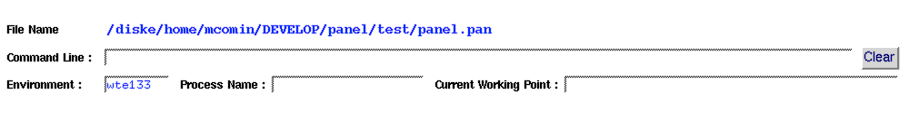
Shows the full path name of the current panel.
Allows the user to set or re-define global variables while the panel is running or when loading a new panel : the
"Clear" button at the end erases the field.
� Type the new definitions in , for example
"gvar(myVar)=newValue"
� Type the new definitions in , for example
"gvar(myVar)=newValue"
� Press RETURN to set the new values.
Sets the name of the panel ( as a process). If this is empty the process name is formed by concatenating the panel file name and the process ID in order torun multiple copies of the same panel within the same RTAP environment..
Sets the Current Working Point for the panel under design : the user must type the new value in and press <RETURN> . In case of error the value changes color and an information dialog box appear.
The window shows some geometrical information about the panel
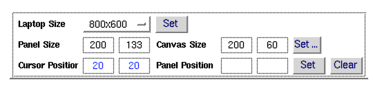
Allows the user to set the panel dimensions in order to fit into a laptop screen. Once the laptop size has been choosen, the button "
Set" is used to apply it to the panel under editing.
Total size of the panel : the size is automatically updated when the user re-sizes the panel.
Coordinates in the canvas of the "insertion cursor" and identifies the position where a new widget will be placed. This information is repeated in the "Widgets" window.
Size of the canvas in the panel : the size is automatically updated when the user re-sizes the panel.
The button "Set .." allows the user to set the canvas size to a given dimension. This can be useful while designing a set "uifClass-widget" which need to have all the same size.
Sets the final position of the panel -i.e.- when executed the panel will popup in this position on the screen. During editing the panel can be moved around without changing this parameter, unless the user clicks on "
Set" .
If this feature is not used the "Default Position" shows no values.
This feature can be disabled by clicking on "
Clear" and the final position is set to the one where the panel was when saved.
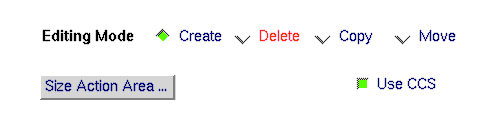
The widgets layout on the canvas can be manipuleted through the following commands :
Create (default configuration)
Go with cursor on the list shown by the window "widgets" and click on the selected widget : the widget will appear in the insertion position with a standard configuration.
Allows the user to move a single widget or a group of widgets.
- Go with cursor on the widget, press
<B2> and drag it to the new position.
To move a group of widgets
- Set the "Editing Mode" to
Move ( the cursor will change shape )
- Move the cursor in one postion on the screen and press
<B1>
- Drag the cursor and include in the rectangle that will be drawn all the widgets to be moved and release
<B1> at the end of the widget selection.
- Press
<B2> and drag all the widgets to the new position.
Allows the user to move a single widget or a group of widgets
To delete a single widget
- Set the "Editing Mode" to
Delete ( the cursor will change shape )
- Position the cursor on the widget and click
<B1>.
To delete a group of widgets
- Set the "Editing Mode" to
Delete ( the cursor will change shape )
- Move the cursor in one postion on the screen and press
<B1>
- Drag the cursor and include in the rectangle that will be drawn all the widgets to be moved and release
<B1> at the end of the widget selection.
- At this point a dialog box appear to get the user's acknoledgment for the delete operation.
Creates an instance of the selected widget with the same options setup but different name.
- Set the widget insertion cursor where you want the widget to appear
- Position the cursor on the widget to be copied and click
<B2>.
Allows the user to change the height of the panel's action area. When the first action button is added, the size of this area is automatically changed to accomodate one row of buttons.
The width changes automatically when the panel is resized.
This flag controls the panel initialization : when active (ON) the panel is linked to the RTAP environment.
5.2.7 Action Buttons Area
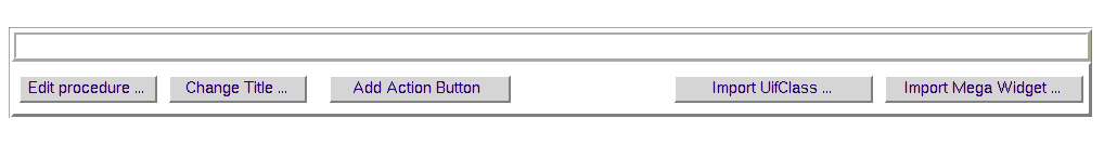
This button starts a GUI facility to edit procedures which are stored in the panel definition file.
See Chapter
2.5 for an explanation on the use of this feature.
Prompts you for the name of the current panel and renames it according to your choice.
Note that this name is not used by the Save option from the File menu.
Adds an "actionbutton" at the bottom-left of the current panel. The button can be moved with the middle-button of the mouse.
� By default the size of the action area is such to accomodate only one row of buttons. If you require more space, this can be set in the upper part of the panel to configure `action buttons'
� The action area automatically disappears when the last `action button' is removed from the panel.
Calls the "class-browser" which allows the user to select a "uifClass-widget" class and adds it to the current layout.
Calls the "class-browser" which allows the user to select a mega-widget class and add it to the current layout.
5.3 PANEL CONFIGURATION
This section describe how to configure the global appearance of a panel.
In the menu bar, the menu "Std. Comp" allows the user to add some "standard components" to the panel layout. These components will appear in a well defined positions.
| Menu Bar |
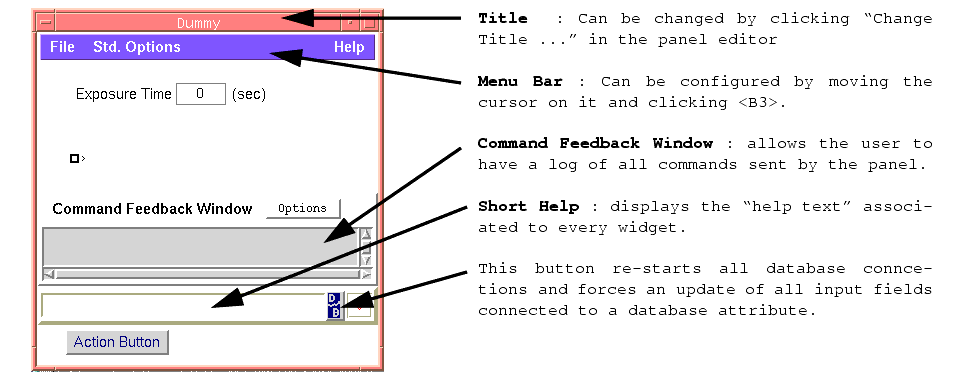
Adds at the top of the current panel a menu bar with two menus named : File and Help. New items can be added by moving the cursor on the menubar and clicking on <B3> The menu configuration panel will appear The "Help" menu button contains the entry "Extended Help". The configuration of this entry can be replaced by an automatic invocation of the on-line Manual of the panel (if present)such as :
exec vltMan $par(MY_NAME) |
| Short Help |
Adds at the bottom of the current panel the short help area where the short help text linked to each widget is displayed every time the mouse pointer focuses on a widget (see widget configuration window)
At the end of the short help there is a button that allows the user to re-start all database connections and forces an update of all input widgets.connected to a database attribute |
| Cmd. Reply |
Adds at the bottom of the canvas the "Command Feedback Window" used to display all replies to commands sent by the procedure panSendCommand. The size of the window (# of rows) can be changed by clicking on the button "Size Action Area ...". |
| Heart Beat |
This check button defines whether to include the heart-beat widget in the short help |
| Add "Std. Options" |
(Obsolete !! and replaced by the "DB" symbol next to the heart beat)
This command allows the user to add the new "std. Options" menu button to old panels where this is not automatically added. The standard menu bar now contains a menu called "Std. Options" which allow the user to handle some database operations, such as to force a refresh of all database values and restart the DB events. |
5.4 WIDGET CONFIGURATION (Common Part)
Widgets can be configured by using the widget configuration window that is called by placing the cursor on the widget and clicking the right-most button of the mouse : up to three widget configuration panels can be active at the same time.
The widget configuration window is formed by a set of common parameters and a set of parameters which appear according to the type of widget.
5.4.1 Common Parameters
Here follows the list of common parameters (possible exceptions are indicated) :
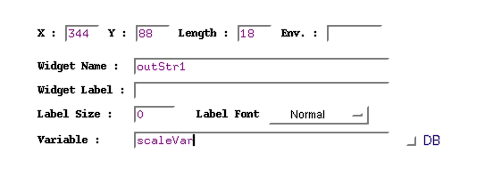
| posX, posY |
Widget position in pixels of the panel element . The origin of the reference system is the upper left corner , at coordinates (0,0). The user can also change these values, and the widget will be moved to the new position when the configuration is applied |
| Length |
Specifies the widget length |
| Widget Name |
The name by which the widget is known by the panel editor. The panel editor gives a default name when the widget is created |
| Widget Label |
String used to indicate the widget's function. |
| Label Size
Label Font |
Length of the label in `number of characters'. This is normally used to align widgets which have non-proportional fonts - e.g.- helvetica
Type of font for the label : this can be "Courier" or "Helvetica" depending on the widget. This option provides a well defined set of fonts which include `normal' and `bold' font types.
|
| Env. Name |
Name of the CCS environment used to access the widget's parameter referring to a database element. This name applies to all database elements specified in the widget configuration.
When this is an `empty' string, the default the accessed database is the one of the CCS environment specified by the environment variable RTAPENV.
|
| Variable |
Name of the variable associated with the widget. The variable is actually mapped into the array gvar as described in par. 2.2.3 |
| DB |
It is a flag located beside an input field to indicate if the specified parameter is a database address |
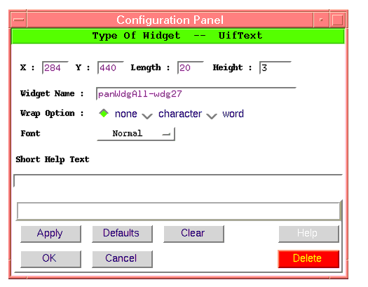
5.4.2 Configuration Actions
At the bottom of each widget configuration panel there are two sets of buttons : the first set provides functionality to `edit' and `change' the widget configuration, while the second group is used to leave the panel.
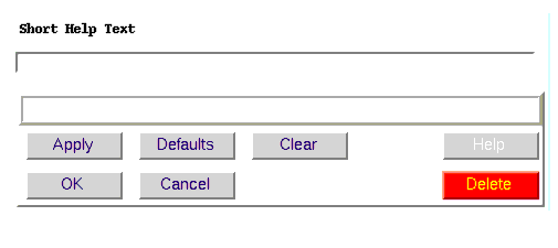
| Short Help |
Specifies the message which is displayed when the mouse focuses on the current wiget. |
| Apply |
Changes the widget configuration according to the current parameters without closing the panel. |
| Defaults |
Replaces the current specified parameters with the default values. |
| Clear |
Clears all input fields |
| Help |
Not Yet Implemented
|
| OK |
Changes the widget configuration according to the current parameters and closes the panel. |
| Cancel |
Closes the panel without changing the widget configuration. |
| Delete |
Deletes the widget. |
5.4.3 Standard Commands
The panel editor provides a set of standard commands which are accessible by the following buttons in the widget configuration panel.
Select Action... Allows the user to choose between a defined list of actions.
Select Panel... Allows the user to choose between a defined list of panel templates.
5.4.4 Configure List Elements
This panel is used to configure several widgets such as uifListBox, uifOptionButton, etc ... and according to the type of widgets some fields are not applicable and hence they will be disabled.
The behaviour of the panel changes depending on whether the field "pos" is enabled or not.
"Pos" Field Enabled
In this case an element is added to the list in the position specified by the "Pos" field.
If the field is left empty the position is by default the "end" of the list.

| Add element |
Write the new value into the "List Element" entry field
Specify its position in the list . If the position is greater than the current number of element or is "end", the new element is added at the end of the list. Type "Return" to add it. |
| Modify an element |
Select the element to modify by clicking on <B1>. Modify the text written in the "List Element" entry field Type "Return" to add it. |
| Delete an element |
Select the element to modify by clicking on <B1> Click on "Delete Item" "Delete All" erases the whole list of elements. |
"Pos" Field Disabled
In this case the insertion position of the element is determined by the number specified in the "Value" field. The number specified in the field "Value" is compared with the others in order to have a set of ordered values.
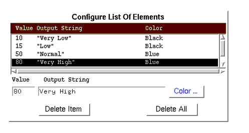
| Add element
Values are sorted into increasing order and the new element is automatically added in the proper position
|
Specify value, string and color :
Type "Return" to add it. |
| Modify an element
A new element will appear in the proper position and it is up to the user to delete the old one.
|
Select the element to modify by clicking on <B1>
Modify the configuration parameters Type "Return" to add it. |
| Delete an element |
Select the element to modify by clicking on <B1> Click on "Delete Item" "Delete All" erases the whole list of elements. |
5.5 WIDGETS CONFIGURATION (Specific Widgets)
5.5.1 Action Button
This bottom part of the panel contains buttons that allow the user to trigger actions which are relevant for the whole panel and do not call any other panel.
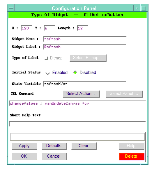
Specific Configuration Parameter
| Initial State |
Sets the button's initial state. If the variable used to control the button's state exists, the button will derive its initial state from the value of such variable. |
| State Variable |
Name of the variable controlling the status enable/disable of the button. |
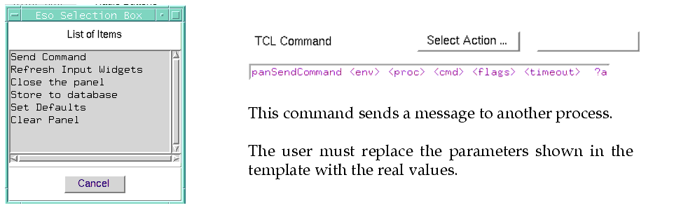
| TCL Command |
The command invoked to execute the action must follow the TCL syntax.
This can be any valid TCL expression as specified in paragraph 2.4.1 on page 40
|
| Select action... |
Allows the user to choose between a defined list of actions. |
5.5.2 Arrows Button
This widget is formed by two buttons with `up/down arrows' which allow the user to increase or decrease the value of a variable.
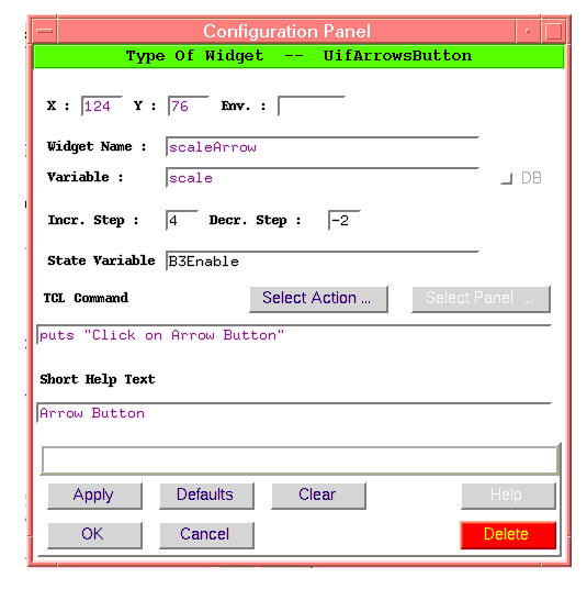
Specific Configuration Parameter
| Incr Step. Decr Step |
Defines by how much the variable will be increased or decreased respectively each time the user clicks on the `up-arrow' |
| Variable |
Name of the variable to be increased/decreased. |
| State Variable |
Name of the variable controlling the status enable/disable of the button. |
| TCL Command |
Here the user can call a procedure which is executed after the variable has been increased/decreased.
|
5.5.3 Bar Chart
This widget gives a graphical representation of a numerical quantity.
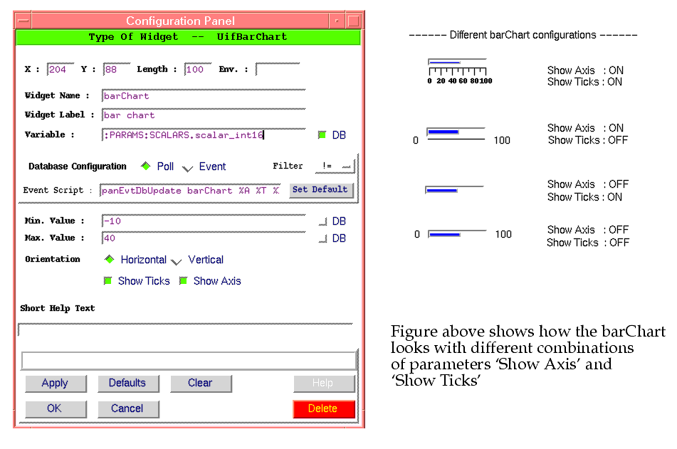
Specific Configuration Parameters
| Variable |
Name of the variable where to read the value from. |
| Min. and Max. |
Define the range of the numerical quantity |
| Orientation |
Specifies in which direction the widget is aligned. |
| Show Axis |
Enables axis display : this include the label, if defined |
| Show Ticks |
Enables tick display : this subdevides the range into fixed intervals.
|
5.5.4 Bitmaps
The panel editor supports "graphics" by allowing the user to insert bitmaps in the panels.
Bitmaps are used to :
� Implement the concept of "Hot-Spots". Following the RTAP terminology the "Hot-Spot" is a graphic symbol where the user can click to call another panel.
Utility xfig can be used to make drawings and convert them into bitmaps which can be displayed in a panel.
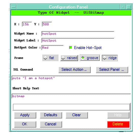
Specific Configuration Parameters
| Enable Hot-Spot |
Determines wether the bitmap is regarded as a simple drawing or as a "Hot-Spot". If this is enabled the part regarding TCL commands is also enabled. |
| HotSpot Color |
Defines the background color of the bitmap, when used as "Hot-Spot". If used as `Hot-Spot , the bitmap changes its background color as the user moves the mouse onto the bitmap. |
| Frame |
Type of frame surrounding the bitmap : the default setup is `no frame'. |
| TCL Command |
This can be any valid TCL expression as specified in paragraph 3.4.1 on page 50 |
| Select Action... |
Allows the user to choose between a defined list of actions.
|
| Select Panel... |
Allows the user to call a panel. |
5.5.5 Button
A push button is used to trigger an action. The action can also require interactive assistence by the user by calling another panel. In the latter case the name of the push button is followed by three dots , for example "Set CCD Binning ...".
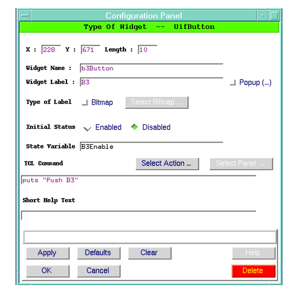
Specific Configuration parameters
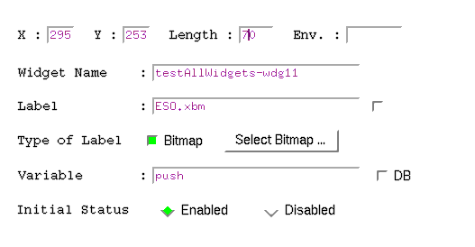
| Label |
Describes the action taken by clicking the button. The label can be either an ASCII string or a bitmap : in the latter case the flag "Type Of Label" should be set to "Bitmap" (see later for details ) |
| Popup |
Configures the push button to simply trigger an action or to call another panel. In the latter case three dots (...) are automatically appended to the button label |
| State Variable |
Name of the variable controlling the status enable/disable of the button Disabled push buttons are displayed with a fainted label. |
| TCL Command |
This can be any valid TCL expression as specified in paragraph 3.4.1 on page 50 |
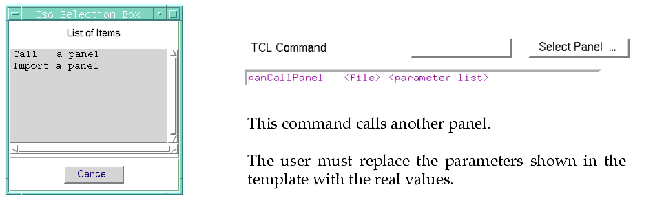
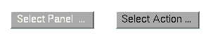
| Select Panel ... |
Provides a pre-defined set of commands (see paragraph 5.4.3 on page 104 for more details)
|
| Select Action ... |
Provides a pre-defined set of commands (see paragraph 5.4.3 on page 104 for more details) |
The following example shows that the button "SelectPanel ..." iss disabled while "Select Action ..." is enabled.
Configure the label with a Bitmap.
The button can be configured to use a bitmap to describe the action, to do this :
� Set Type of label to "Bitmap" and click on "SelectBitmap".
� Use the file selection box to go into the "bitmaps/" module's directory and select a bitmap. Once selected the field "
Label" shows the name of the selected bitmap.
� Click on "
Apply" and adjust the widget length.
5.5.6 Check Button
A check button allows the user to select/de-select an option.
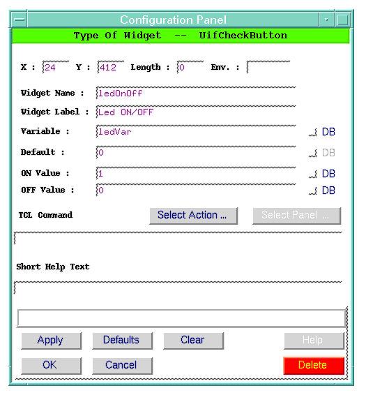
Specific Configuration Parameters
| Label |
Describes the value represented by the button. |
| Variable |
Name of the variable where to store the value |
| ON Value |
Value to give to `variable' when the button is ON ( default = 1) |
| OFF value |
Value to give to `variable' when the button is OFF ( default = 0) |
| TCL Command |
This can be any valid TCL expression as specified in paragraph 3.4.1 on page 50 Before execution the <variable> is set to the corresponding ON or OFF value. |
5.5.7 Dummy Frame
This widget is used to `reserve' part of the panel and allows the user to fill it with application specific widgets.
� Do not use it to `decorate' the panels.
� The panel editor does not directly support any mechanism to add widgets to the frame, but this must be done programmatically : this
requires a good knowledge of Tcl/Tk programming.
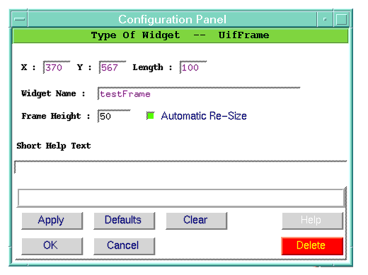
Specific Configuration Parameters
| Frame Height |
Controls the height of the frame |
| Automatic Re-Size |
If enabled the frame re-sizes automatically according to the space occupied by the widgets the user packs into it. If not enabled the frame maintains the specified size. |
5.5.8 Entry
The entry widget is a single-line input fields.
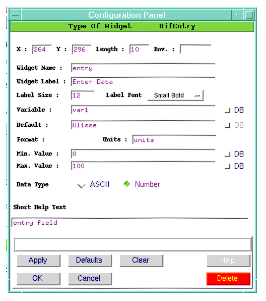
Specific Configuration parameters
| Widget Label |
String to be written at the left side of the widget : the label and the widget are separated by ":". |
| Variable |
Name of the variable where to store the input. |
| Default |
User defined default value |
| DataType |
Specifies the expected type of input. This feature is only used when the user wants to `clear' all entry fields of a panel : see panResetPanel. Numerical variables are replaced with `0' while those declared ASCII will get an empty string. |
| Min. and Max. |
Define the range of the numerical quantity
|
| Units |
This is a string which is appended at the right side of the widget indicating the nature of the input value
|
The typed characters are inserted after the current cursor position and the following operations are supported :
|
|
|
| Left/Right Arrow |
Moves the cursor left/right from current position |
| Backspace |
Deletes the next character left from the cursor |
| Delete |
Deletes the next character right from the cursor |
| Home |
Displays the first part of the string and set the cursor at the beginning of the string |
| End |
Displays the last part of the string and set the cursor at the end of the string |
| Cut & Paste |
Performed as follows : - Select the text - Move the cursor onto the destination widget - Press <B2> to `paste' the text. |
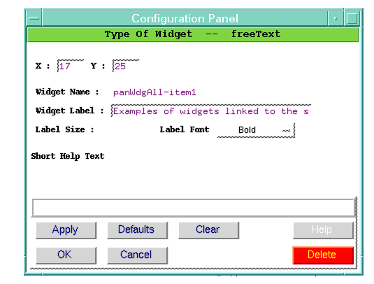
5.5.9 Free Text
This allows the user to write text on the panel.
To modify an existing `Free Text' widget without using the configuration panel, position the cursor on top of the widget and click on <B1> : the insertion position will be flashing.
� The left/right arrows can be used to move the insertion position.
�
Backspace and
Delete keys , delete the first character left from the cursor.
� To take a Free text widget away from the panel, delete the whole string : this will not be saved.
� The text can be split over several lines by inserting the `new-line character
\n' (this can be done only in the configuration panel).
Specific Configuration parameters
| Widget Label |
String which is part of the text. |
5.5.10 Output Led
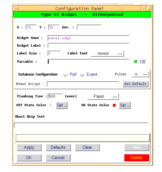
This widget allows the user to graphically display the status of a component or sub-system. This is based on the uifLed widget and displays an ON/OFF status by changing color.
It can be configured in the following modes :
| Normal |
The widget switches between the ON/OFF conditions according to the value assumed by the variable : a 0 (zero) value switches the led OFF and any other value switches the led ON. |
| Flash |
The widget does not follow the variable's value but it reacts "at any write". The led is switched ON for a time defined by the parameter "Flashing Time" and then it goes OFF. |
| Blink |
The widget keeps "blinking" as long as the value of the associated variable is NOT ZERO, and it goes OFF as soon as the variable is set to zero. The ON/OFF state are determined by the parameter "Flashing Time". |
Specific Configuration parameters
| Flashing Time |
Defines for how long the led is switched ON when configured to trigger on transition. |
| Flashing Mode |
Configure the widget to trigger on transition otherwise it reacts to the variable's value. |
| OFF State Color
ON State Color |
Define the ON/OFF colors. One of the colors of the palette is the color of the `canvas'. |
5.5.11 List Box
The listBox allows the user to select an item out of a list.
Specific Configuration parameters
| Variable |
Name of the variable where to store the selected item |
| Default |
User defined default value |
| Geometry |
Specifies the listBox dimensions in the format : WidthxHeight. Height defines the number of `visible' lines. Width defines the number of charactes per line. |
| Select Mode |
Defines how the user can select elements from the listbox (see man page to get details on how the list of values is returned) - Single : Only one element can be selected - Browse : Only one element can be selected by dragging with the mouse. - Multiple or Extended : Any number of elements can be selected. |
| X/Y Scroll |
Enable Horizontal/Vertical scroll bars.
|
| Font |
Specifies the font : this is a subset of "Courier" fonts. |
5.5.12 Option Button
The Option Button allows the user to select an element of a list. The advantage of this widget with respect to the listBox is that is does not need much space in the panel and the selected element is always displayed.
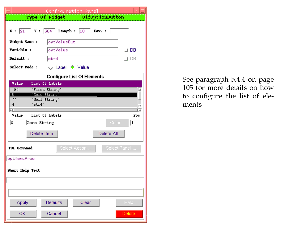
Specific Configuration parameters
| Variable |
Name of the variable where to store the selected item |
| Default |
User defined default value |
| Select Mode |
Each item of the option button has associated a label and a value.
The widget always shows the label of a selected element.
What the variable associated to the widget will contain is determined by the select mode : - Label : the variable contains the label. - Value : the variable contains the value |
| TCL Command |
Name of a procedure to invoke when the user selects an option. The UifOptionButton man page contains an example of use. |
Example :
Let's assume that we have a parameter driving the setting of an instrument and that the mode is described by an integer.
The user is much more interested to select the mode through a mnemonic rather than from a number, therefore we want the uifOptionButton to be able to :
� display a string describing the mode
� assign the associated integer to the variable.
| Configuration Parameter |
Value |
| Variable |
selectedMode |
| Select Mode |
Value |
| List Of Elements |
Value List OF labels
--------------------------
0 "IDLE"
1 "MODE 1"
2 "MODE 2"
3 "MODE 3"
4 "NOT AVAILABLE"
|
Now when the user selects "MODE 1", the widget will display this string, but the variable associated to the widget will be set to "2".
On the other hand if we perform :
set gvar(selectedMode) 4
The label of the widget will be "NOT AVAILABLE"
5.5.13 Output and Output Array
The output widget is used to present information to the user. The widget can be configured with a specific font size and foreground color according to the importance of the nature of the information.
For instance the remaining time of an exposure should be displayed in bigger visible characters or the status of an equipment can be displayed using "red" color to represent a faulty condition.
Two versions of the widgets are available :
�
Output Widget : this is mainly used to display SCALAR information
�
Output Array : this widget is specialized to display part of a VECTOR or part of a TABLE column. The widget creates a number of `cells' ( specified by the parameter "Array Size") each displaying one element of the vector or of the table.
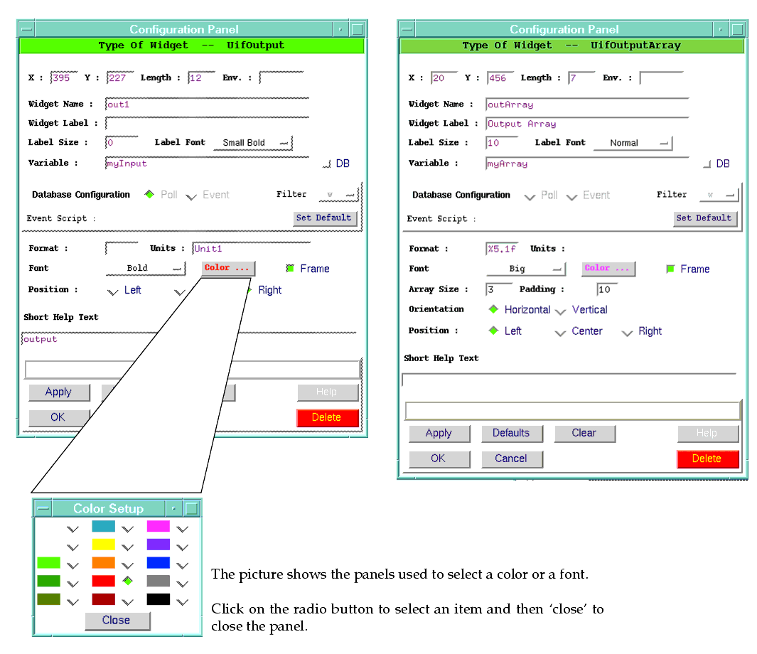
Specific Configuration Parameters
| Variable |
Name of the variable where to read the value from |
| Font |
Specifies the font : this is a subset of "Courier" fonts. |
| Frame |
Enables the drawing of a frame around the widget. |
| Format |
This is a printf like statement which is used to format the values displayed by the widget. If the format does not apply to the current value, the widget displays the qualtity as it is -i.e.- without applying any formatting.
For example in TCS application some numerical data are set to a "?" when they are not valid. |
| Units |
String to be appended to the right size of the widget to indicate the nature of the displayed value. |
| Position |
Position of the value within the widget |
|
|
Parameters specific to the Output Array widget |
| Array Size |
Specifies the number of `cells' to be created in the Output Array widget. |
| Padding |
Integer specifying the spacing between `cells'.
|
| Orientation |
Defines the horizontal or vertical orientation of the `cells' of the widget.
|
5.5.14 Output List
It allows the user to define a set of keywords to be displayed in different color -e.g.- if a device status is represented by values like "ERROR", STANDBY,"ONLINE", "MOVING", they can be displayed in different colors.
This widget is a specialization of the uifOutput widget and hence all the options valid for that widget apply to the uifOutputList as well.
Two more options have been defined :
| listKey |
List of keyword to be displayed with a color different from the widget's default color. |
| listColor |
List of colors associated to each keyword. |
This widget is available from the following modules : panel 5.12 and uif 3.32
5.5.15 Output String
The output string widget is used to present information to the user. The widget is configured to associate a string to a range of values. It compares the variable current value with those ranges to detect in which range the current value falls into and display the proper string.
The widget can be configured with a specific font size and foreground color according to the importance of the nature of the information.
Specific Configuration parameters
| Variable |
Name of the variable where to read the value from |
| Frame |
Enables the drawing of a frame around the widget. |
| Position |
Position of the value within the widget
|
| Font |
Specifies the font : this is a subset of "Courier" fonts. |
5.5.16 Radio Buttons
A sequence of radio buttons allows the user to choose one value out of many. Several radio buttons can be used to let the user choose among different values. Radio button are related together by sharing the same "Variable" parameter.
Specific Configuration parameters
| Label |
Describes the value represented by the button. |
| Variable |
Name of the variable where to store the value |
| default |
The default value is set automatically when the panel is created. The re-configuration of this parameters automatically configures with the same value all the radio buttons associated to the same variable. |
| ON Value |
Value to give to `variable' when the button is ON ( default = 1) |
| TCL Command |
This can be any valid TCL expression as specified in paragraph 3.4.1 on page 50 Before execution the <variable> is set to the corresponding ON or OFF value. |
| OFF value |
Value to give to `variable' when the button is OFF ( default = 0) |
| TCL Command |
This can be any valid TCL expression as specified in paragraph 3.4.1 on page 50 Before execution the <variable> is set to the corresponding On Value. |
5.5.17 Scale
Lets the user select a value from a range of numbers.
Specific Configuration Parameters
| Label |
Description of the controlled quantity |
| Variable |
Name of the variable where to read the value from. |
| Default |
User defined default value |
| Min. and Max. |
Define the range of the numerical quantity
Beware that if MIN > MAX the scale widget does not work.
|
| Orientation |
Specifies in which direction the widget is aligned.
|
| digits
|
This number configures the widget to set the variable with and integer or a real number. If digits = 0 the delivered number is always an integer, otherwise it delivers a `real'
|
5.5.18 Text Widget
A text widget displays one or more lines of text and allows that text to be edited.
Specific Configuration parameters
| Length |
Number of characters per line |
| Text Height |
Number of visible lines. |
| Font |
Font to be used. |
| Wrap Option |
Specifies how to handle lines in the text that are too long to be displayed in a single line of the text's window.
In none mode, each line of text appears as exactly one line on the screen; extra characters that don't fit on the screen are not displayed.
In char mode a screen line break may occur after any character
in word mode a line break will only be made at word boundaries. |
Extraction of the text is possible using the widget's method (see man pages)
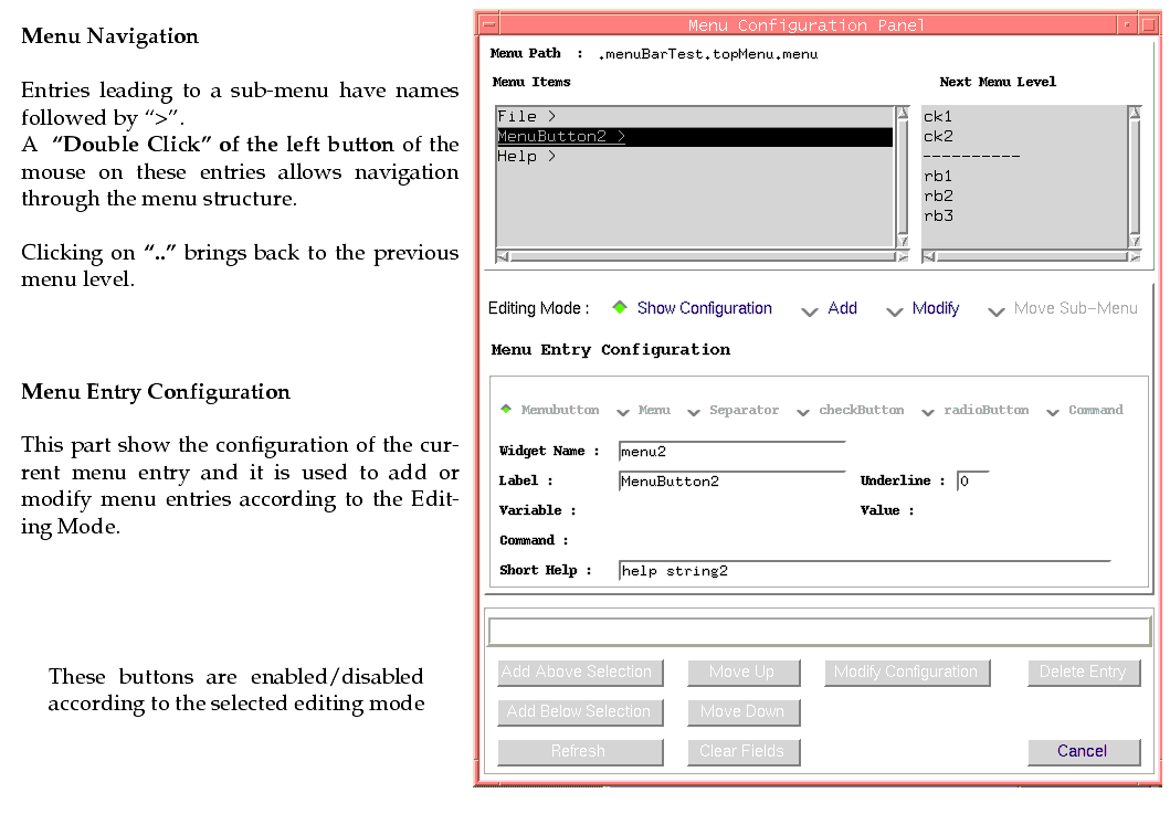
5.6 MENU BAR
The menu bar is placed at the top of the panel and can be inserted to or removed from the panel by clicking the
"Menubar" option in the "
Std. Comp." menu of the main panel.
The menuBar is formed by a row of widgets called "menuButtons" which give access to the underlying menu structure : each menu can contain the following kind of entries :
cascade A cascade entry is associated to a sub-menu.
separator Creates a `separation' line between menu items
checkButton Creates a menu item with the characteristics of the `checkButton' widget
radioButton Creates a menu item with the characteristics of the `radioButton' widget
command Creates a menu item which invokes a command
5.6.1 Configuration Panel
When the menu bar appears in the panel, it can be configured by clicking on it with the
<B3> and the menu bar configuration panel appears
The top part of the configuration panel allows the user to navigate through the menu structure. Each menu is defined by a path name which is formed by `words' concatenated with "."
The conventions used in this panel are :
� Menu Items leading to a sub-menu have the name followed by
">"
� A
single click of the mouse left-button on an item shows the item configuration and if this leads to a sub-menu, the menu components appear in the "Next menu Level" listBox.
� A
double click of the mouse left-button to an entry leading to a sub-menu, changes the current configuration to the next menu level : the entry "
.." brings back to the previous level.
The Menu Entry configuration describes the configuration of the current entry : the different fields are enabled according to the type of entry.
The behaviour of the configuration panel is driven by the selected "Editing Mode", in particular the button at the bottom are enabled/disabled according to the current editing mode.
They provide the following functionality :
| Add Above/Below Selection |
Add the menu entry as specified in the "Menu Entry Configuration" , above/below a selected entry. |
| Move Up/Down |
Move selected menu entry one position up/down |
| Modify Configuration |
Replace the configuration of the selected menu entry with the one specified in the "Menu Entry Configuration" |
| Clear Fields |
Clear all entry fields |
| Refresh |
Updates the contents of the menu configuration panel according to the new menu structure : this is active when a new panel has been loaded. |
| Delete Entry |
Deletes the current menu entry. If the entry is a cascade menu or a menuButton , the whole sub-tree is deleted. |
| Cancel |
Exists the configuration panel. |
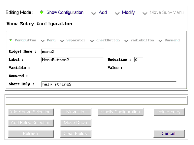
5.6.2 Edit Mode : Show Configuration
The user can navigate through the menu structure and see the configuration of the associated menu entries.
� The Menu Entry Configuration displays the selected menu entry and only the fields which apply to a given menu type are enabled.
� No operations are allowed in this mode : the button at the bottom are all disabled.
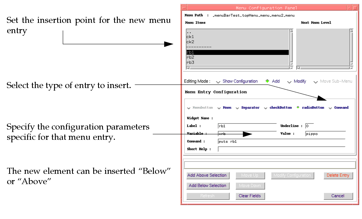
5.6.3 Edit Mode : Add
In this mode the user can navigate through the menu structure and set the position where to insert the new element ( single click on the menu entry ).
� The "Menu Entry Configuration" does not change when the user selects a menu entry.
� The user can configure only the parameters specific to the selected type of menu entry.
� The new element can be inserted "
Below" or "
Above" the insertion point.
� The change is immediately reflected in the `working panel'
To Add a new element do the following :
| User Action |
Parameter |
Value/Action |
| Select the type of menu item to insert and fill the configuration parameters |
|
Click on one of the radioButtons at the top of the "Menu Entry Configuration" |
| Select The position |
|
Navigate in the menu tree and select where to add the new entry. |
|
The change is immediately reflected in the panel |
|
Click on "Add Above/Below Selection |
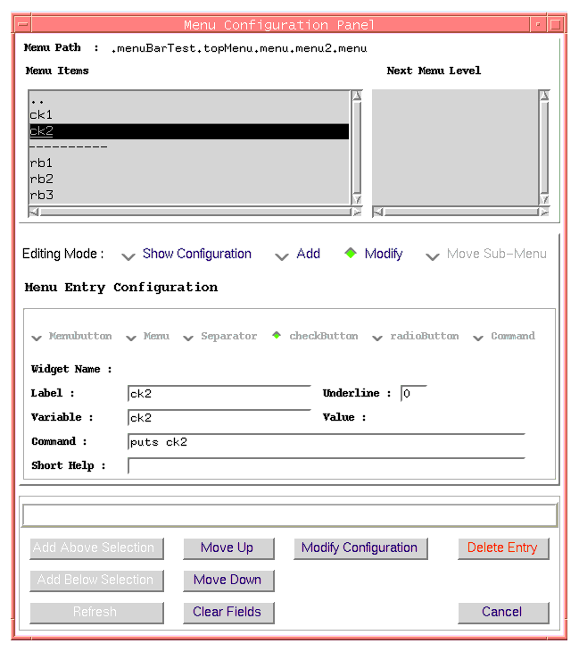
5.6.4 Edit Mode : Modify
An existing menu entry can be modified by selectin the "Modify Configuration" option.
� The Menu Entry Configuration changes according to the selected menu entry.
� The Menu Entry Configuration shows only the fields which pertain a given menu entry.
� The new parameters are taking into account only when the user clicks on "Modify Configuration" button at the bottom of the panel.
