| |
|
|
|

1 VLT Look & Feel
This chapter provides an overview of the concepts on which the VLT User Interface is based.
This chapter is a summary of mandatory rules applicable to the design of GUI panels.
These rules are also used to check the compliance of GUIs to the ESO Common Conventions during the acceptance of the delivered user interface.
Any point which is not satisfactory in the ESO/GUI Common Conventions should be submitted in a `Change Request' SPR.
1.1 OVERVIEW
The VLT User Interface is based on the ESO/GUI Common Convention whose aim is to provide a guideline to develop homogeneous sets of panels. The Common Conventions establish rules which deal with the following subjects :
1. Panel Layout The layouts are classified according to the panel function. The key elements of the panel always appear in the same position.
4. User Interaction. This part defines standards to convey messages to the user and wait for the user acknowledgement.
5. Customization. This section specifies the characteristics of a user interface that can be customized by the user such as : colours, fonts, etc ...
1.2 DESIGN GOALS FOR THE VLT PANELS
The ESO/GUI Common Convention provides a general description of the VLT User Interface characteristics, however the kind of operations for the VLT and the day-to-day (night-to-night) activities put restrictive guidelines on the use of the user interface components.
During the design and the building of prototypes further restrictions for the design of the panels for the VLT telescopes and instrumentation will be defined and become part of the VLT/UIF Functional Specification.
1.2.1 Interface Design
This section provides guidelines on how to organize the interface for a given system and in particular the various panels forming the whole interface.
· The overall layout of the user interface for a given instrument/telescope must not require frequent switching between panels, giving preference to a more `static' operating environment.
Along this line the information should first be placed into a single panel and split into other panels only if the panel becomes too cluttered.
· In order to be able to quickly navigate through the control software, redundancy could be a legal and important feature.
(For instance : the same panel can be called from two different places, or the same command can appear in two different panels).
· At creation time the windows are popped up at a pre-defined position and should not require re-positioning by the user.
1.2.2 Panel Design
· Control Panels should contain all push buttons which make the user able to take actions in response to the current status.
· The order (top-down or left-right or both) in which components are organized in a panel must follow some scheme, e.g. descending importance, or typical temporal sequence, or order of optical components passed by the incoming light.
Information belonging to this category could be for example, the shutter, the telescope slit, image transfer, calibration lamps, etc ...
Information belonging to this category goes beyond basic level of operation, for example : CCD window read-out, meteorological information, etc ..
In this case the whole information can also disappear from the panel if it does not pertain to the current status. (e.g. the information about the window read-out is shown only if the user has actually selected to operate with a smaller portion of the CCD).
· In some cases Control Panels used only to monitor the equipment activity can have no push buttons.
It is anyhow recommended to use the same panel for active control and monitoring purposes since button present in Control Panels can be disabled during a monitoring session.
· At run-time it must be possible to disable push-button whose action does not pertain to the current context. Disabled push-button must be visibly flagged.
· Minimize the use of Put-down menus. PopUp menus are not allowed except for the root menus which are provided by the window manager.
1.2.3 Use of Dialogue Windows
· The Question Dialogue shall be used only for potentially dangerous command, for instance abort exposure.
· The Working Dialogue shall not be used not so often and only if another long process get involved, for instance a file transfer.
· Information Dialogue is used to ask the user to input parameters for a command. It can be exceptionally used to convey an error message to the user.
1.3 PANEL LAYOUT
This section defines rules for the appearance of the VLT user interface used to control the telescopes and the instruments.
Panels are the main means of interaction between the user and the VLT control system and are formed by windows containing widgets to interact with the user and displaying information in a textual or graphical format.
All the panels have the same structure made of several areas. Some areas are always present in every panel while others appear only on some.
Therefore we identify the following five areas :
It is a MOTIF widget and it is formed by a list of put-down menus each providing general functions common to most applications. When present, it contains at least the File and HELP selections.
This section is organized according to the panel type. The VLT panels are classified into the following categories :
(b) Control Panel These are used to display information and give the user the possibility to invoke actions according to the current status.
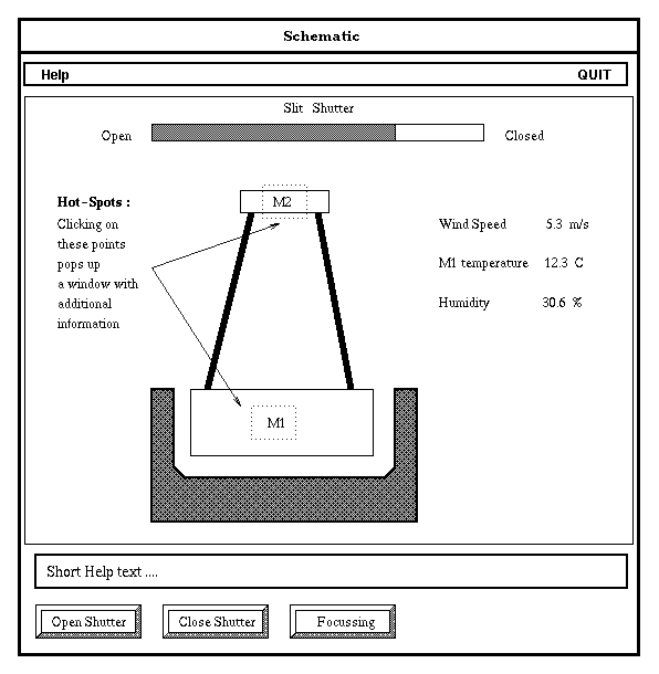
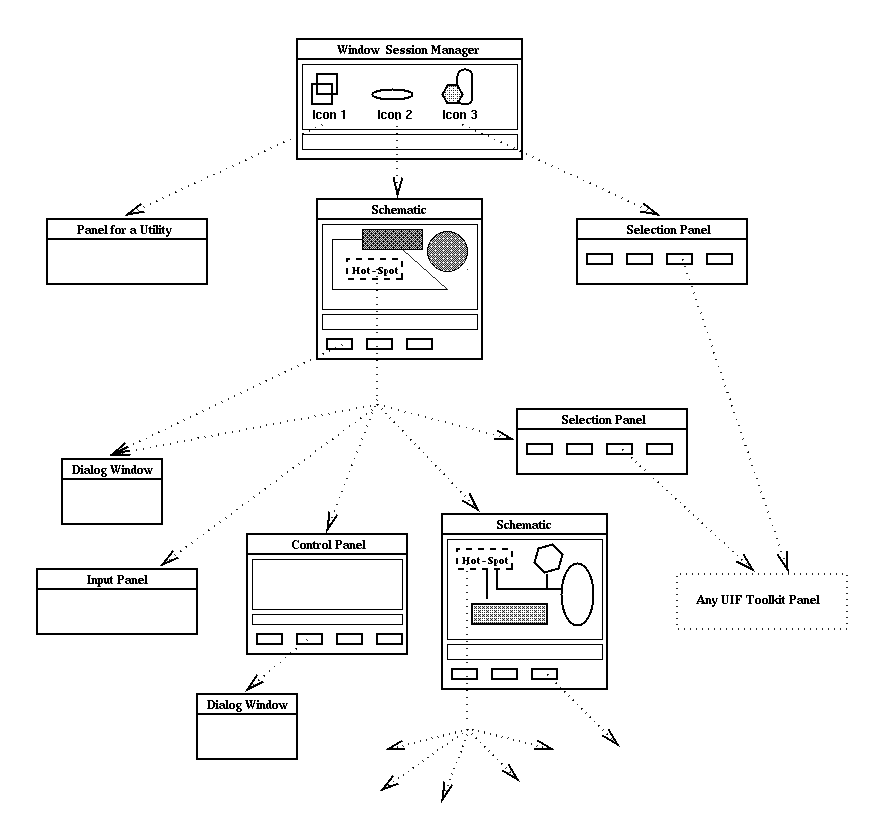
(d) Schematics These are used to provide the user with a graphical representation of the status of the system. Through special symbols called `Hot-Spots' the user can call input panels, status panels, selection panels or another schematic.
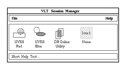
1.3.1 VLT Session manager
The Window Session Manager is the top-level window from which the user can access a heterogeneous set of utilities and operative environments.
The Window Session Manager is structured as follows :
When the session allows the user to access a specific VLT environment then the title should identify the context, like for instance, "UVES Session Manager".
In both cases the Window Session Manager can give access to other utilities (e.g. MIDAS, Raw Image Display, etc.. )
3. The Application Area shows the list icons which provide access to utilities (e.g. DB On-line Utility) or operative environments (e.g. UVES or FORS).
When the user clicks on the icon, the top level window of such application pops up.
4. The Short Help area which briefly describes the application when the user moves the cursor on top of the icon.
1.3.2 Schematics
A schematic is a collection of graphic primitives and symbols which represents a model of a system. It can be displayed graphically in a window and can contain specific points, called Hot-Spots allowing the user to call another panel.
The Schematic is structured as follows :
- The Application Area shows a graphical representation of the system and displays the status of the various parts. This area of the panel can contain Hot-spots.
- The Action Area contains a sequence of push buttons which allow the user to start different actions (e.g. send a command to an equipment, call specialized windows to input parameters to be sent along with a command)
1.3.3 Selection Panel
The Selection Panel gives access to different panels or it can trigger general actions (e.g. initialization, recovery, exit, etc.).
The Selection Panel is structured as follows :
- The Action Area contains a sequence of push buttons which can be used to trigger actions and call any other panel.
1.3.4 Status Panel
This is used to display the current status of an equipment and control it by invoking actions.
The control panel is structured as follows
- The Application Area displays the current status of the equipment. This part of the window can contain push buttons to trigger some actions, but it does not have widgets used to input data.
- The Action Area contains a sequence of push buttons which allow the user to start different actions (e.g. send a command to an equipment, call specialized windows to input parameters to be sent along with a command ).
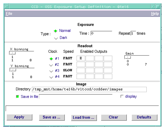
1.3.5 Input Panel
This is used to change parameters in the database, or to set parameters to be directly sent with a command to a process. It contains only input fields and output fields.
The Input Panel is structured as follows :
- The Application Area contains input and output widgets. The first widgets require some input from the user while the second widgets are used to display information that can explain the meaning of the input widgets (e.g. parameter range, units, etc.).
Push-button and Arrow Buttons which are used to trigger an action cannot be inserted in the application area.
- The Action Area contains a sequence of push buttons which allow the user to perform global actions on the data in the application area , such as :
NOTE : The Save and Execute command can be combined, giving to the button the label Save and Execute .
1.3.6 Common Terms
Actions common to a wide variety of panels are addressed with the same name.
Some of these actions can be combined together and executed in sequence as the result of a single user command.
MOTIF terms are used with the following meaning :
The following keywords are VLT specific terms :
1.3.7 Presenting Textual Information
This section provides guidelines on the structure and wording of the messages conveyed to the user. Messages conveyed to the user must allow easy, correct and fast interpretation.
The following guidelines lead to a proper message structure :
· Affirmative. For example, "Complete entry before returning to menu" is easier to get than "Do not return to menu before completing entry".
· In an active voice. For example, "Send the message by depressing TRANSMIT" is more understandable than "The message is sent by depressing TRANSMIT".
· Order words chronologically. If a sentence describes a temporal sequence of events, the order of words should correspond to this sequence
A prompt should say "Complete address and page forward" rather than " Page forward after completing address".
· Use complete words. A complete word is better understood than a contraction or short form. For example "will not" is better than "won't", "not valid" is better than "invalid".
· Use positive terms. It is easier to understand positive, affirmative information, therefore avoid the prefixes "ir-", "in-", "dis-" and "un-".
1.3.8 Organization of a GUI
In the field of telescope and instrument control the user usually has a few windows permanently on the screen, to monitor and operate the related equipments. The majority can be considered as transient since they are used, for instance, to set some configuration parameters.
Application designers shall try to keep to a minimum the number of windows to avoid to clutter the screen : the role of the various panels for the design of an interface is :
· The Window Session Manager makes available to the user all interfaces and utilities which pertain the current session.
The next figure shows the relation between the various panels of an interface.
 Quadralay Corporation http://www.webworks.com Voice: (512) 719-3399 Fax: (512) 719-3606 sales@webworks.com |
| |
|
|
|