3 PROGRAMMATIC INTERFACE
The programmatic interface is formed by the following set a of libraries.
3.1 libpanPublic.tcl
libpanPublic.tcl is a library containing all the `public' procedures used by the panel editor and the VLT GUI developers.
| panCallPanel |
Call another panel specifying run-time parameters in the command line. The called panel is run by another Tcl/Tk interpreter. |
| panDbRead |
Reads database attributes |
| panDbWrite
panDbWriteWidget
panDbWrite Class |
Writes values into the database
Store widget values to a database
Store the values of widgets contained in a uifClass into the database
|
|
panDisplayCommand
panDisplayComment
panDisplayReply |
This set of procedures is usually used to design customized code to send/receive messages.
Let the user know that a given command has been sent/invoked.The user has the possibility to add a comment gving more details of what the current action does.
Display a description of the current action. This can be used tog ive the user high level information on the ongoing activities.
Displays the reply associated to a given command. This is automatically called by panSendCommand.
|
| panImportPanel |
Allows the user to `import' a panel into the current application. The new panel run under the existing Tcl/Tk interpreter, therefore it shares the same data space fo the calling panel. |
| panResetPanel |
Clears all entry widgets. |
| panSelectFile |
Call a file selection box widget to browse through the file system and select a file. |
| panSetDefaults |
Sets all widget to their default values |
| panSendCommand |
Sends commands to a processes. |
| panUpdateCanvas |
Updates all panel's input widgets to the current associated database value. |
|
panGetMbPath panSetMbState
panEnableMenuEntry panDisableMenuEntry
panQueryMenuEntry
|
This set of procedures is used to dynamically alter the current menu configuration.
Returns the full widget name of a menu button Allows the user to enable/disable the menu buttons.
Change the state of the menu button elements.
This procedure searches for a menu entry with label <wdgLabel>, under the menubutton <mbLabel> and returns a list with the following elements : - Full name of the menu containing the entry - Type of the entry : cascade, command, checkbutton, radiobutton - Position in the menu.
|
3.2 libuif.tcl
libuif.tcl is a library consisting of a set of general purpose procedures which can be used for the development of the GUIs.
| findVLTFile |
Searches a file in the VLT directory structure. |
| promptDialog |
Calls a dialog window to get user input |
3.3 libuifClass.tcl
libuifClass.tcl is a library containing all the basic widget used by the panel editor : these widgets differ from the standard Tk widgets because they have a reduced number of widget configuration options and implement additional methods in order to fulfil the VLT Look & Feel.
Widgets are implemented in itk (incremental TK).
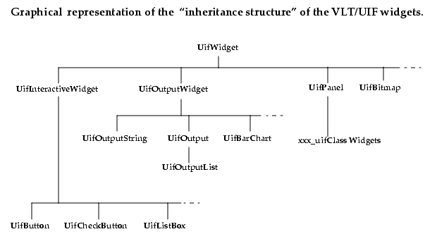
There are three `main basic classes' which are inherited by the VLT widgets and provide common methods and widget options :
| UifWidget
Parent class for all VLT widgets. |
WIDGET OPTIONS - helparea : name of the short help widget - helptext : Short-Help text
METHODS - queryState -getComponentPath |
| UifOutputWidget
Parent class for all VLT widgets displaying information. |
WIDGET OPTIONS - dbMode : Database updating mode. - evtFilter : Condition triggering an event - evtScript : Script to be executed when the event is processed |
| UifInteractiveWidget
Parent class for VLT widgets interacting with the user. |
WIDGET OPTIONS - stateVar : Variable controlling enable/disable state
METHODS - enable - disable |
| UifPanel
Parent class for xxx_uifClass widgets created by the panel editor. |
WIDGET OPTIONS - cwp : Class Current Working Point - library : Widget library where the class is taken from
METHODS - display : Display the class (similar to pack) - unpack : Make the class disappear. - getMyCwp : Return class cwp - refreshInput : Updates all input widgets according to the current database values. |
|
|
List Of VLT Basic Widgets |
| UifActionButton |
|
| UifArrowsButton |
This widgets contains two buttons with up/down arrows and allows the user to increment a variable by a positive/negative increment |
| UifBarChart |
|
| UifBitmap |
Displays a bitmap. In addition the bitmap can be configured to act trigger an action when the user click on it. |
| UifButton |
|
| UifCheckButton |
|
| UifEntry |
|
| UifFileSelBox |
|
| UifLed |
Basic widget implementing the LED device |
| UifListBox |
The listbox can be configured with horizontal and vertical scroll bars. It also provides methods to add/delete and display elements with a given format. |
| UifMenuButton |
Not available from panel editor |
| UifOptionButton |
|
| UifOutput
UifOutputList |
Display numerical and ASCII information
Specialized widget derived from the uifOutput widget. In addition to uifOutput , it allows the user to define a set of keywords to be displayed with a different color. |
| UifOutputArray |
Specialized version of uifOutput able to display values from database vectors or table columns. |
| UifOutputBitmap |
To Be Implemented
Displays a bitmap according to the value associated to a variable |
| UifOutputLed |
This widget is used to graphically display the status of a component (or system) . It consists of a `rectangle' changing the color according to the value of a variable.
|
| UifOutputString |
Displays a string according to the value associated to a variable. |
| UifRadioButton |
|
| UifScale |
|
| UifText |
|
3.4 libuifCommon.tcl
libuifCommon.tcl is a library containing a set common application widgets . These widgets are typically directly implemented in itcl and provide specific `high-level' funtionalities.
Who has developed a widget of common interest can submit the new widgets to the responsible of the VLT User Interface to include it into the library.
|
|
List of Widgets in uifCommon library |
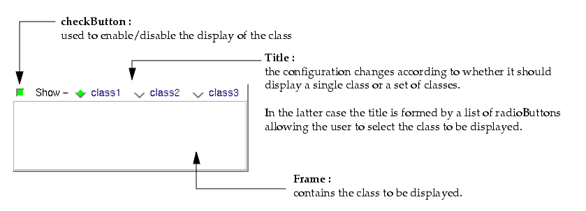
| classContainer |
It displays a class out of a pre-defined set of classes. It also provide programmatic and interactive mechanism to select the class to be displayed |
| classFrame |
It displays a class out of a pre-defined set of classes and a programmatic interface to select the class to be displayed |
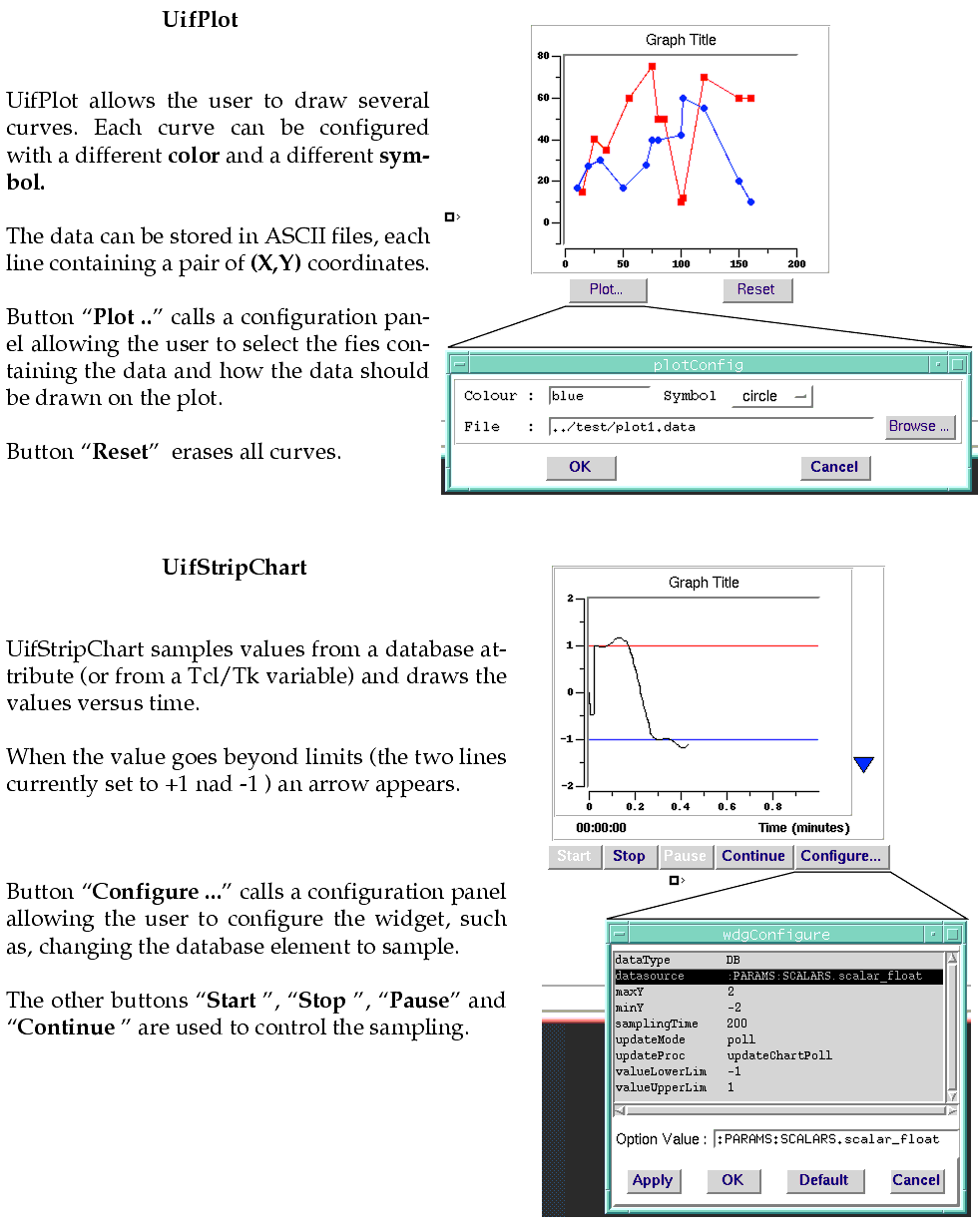
| uifPlot
uifPlotter |
UifPlot is a widget that can be configured to display a static plot
UifPlotter is the interactive version which includes buttons to choose the set of data to plot. |
| uifStripChart
uifStripChartPlotter |
uifStripChart samples the database or a Tcl/Tk variable and plots the values into a graphic versus time.
uifStripChartPlotter is the interactive version which includes buttons to - Start, Stop, Pause, Continue the plot - Configure the element to sample |
3.5 Examples of itk Mega-Widgets
This section contain examples of mega-widgets implemented in incremental Tk (itk).
Documentation on how to build itk widgets can be found in the web -e.g.- two possible addresses are http://www.tcltk.com/iwidgets and http://www.tcltk.com/itk/index.html.
Example 1 : This is a simple example taken from the libuifClass library , in particular the definition of UifOutput widget. The widget is basically a Tk label widget with some more widget options.
itk_option define -label label Label ""
itk_option define -variable variable Variable ""
}; #end of class definition
#------------------------------------------------------
#------------------------------------------------------
body EntryLabel::constructor {args} {
label $itk_interior.label
entry $itk_interior.txt -relief sunken -borderwidth 2
keep -width -relief -font -textvariable
pack $itk_component(lbl) $itk_component(txt) -side left -padx 3
if {[llength $args] != 0 } { eval configure $args }
#---------------------------------------------------------------
#---------------------------------------------------------------
configbody EntryLabel::variable {
$itk_component(txt) configure -textvariable $itk_option(-variable)
#---------------------------------------------------------------
#---------------------------------------------------------------
configbody EntryLabel::label {
if {[set tmp $itk_option(-label)] != ""} { append tmp " :" }
$itk_component(lbl) configure -text $tmp
Example 2 : This is a more complex example of class definition. The widget is called classContainer and it is used to interactively display a class out of a set of classes ( for more details see corresponding man page).
itk::usual classContainer { }
class classContainer {
inherit classCommon
constructor {args} {}
itk_option define -titleFont titleFont TitleFont default {
if {$initialized} { setFont }
}
itk_option define -titleList titleList TitleList ""
public method show {}
public method setShow {}
public method setFont {}
public method getRbVariable {}
public method enableRadioButton { args }
public method disableRadioButton { args }
}; # end of class definition
#------------------------------------------------------
# Constructor
#------------------------------------------------------
body classContainer::constructor {args} {
itk_component add f1 {
frame $itk_interior.f1
}
itk_component add container {
frame $itk_interior.container
} {
rename -background -classBackground classBackground ClassBackground
keep -width -height -relief -borderwidth
}
itk_component add ck {
checkbutton $itk_component(f1).ck -relief flat \
-variable ${wthis}.ckShow -command "$wthis setShow"
} {
keep -background
}
itk_component add title {
label $itk_component(f1).title
} {
keep -font -foreground
}
itk_component add rbBox {
frame $itk_component(f1).rbBox
}
pack $itk_component(f1) $itk_component(container) -fill both
pack $itk_component(ck) $itk_component(title) $itk_component(rbBox) -side left
uplevel #0 set $wthis.ckShow 0
set frameName $itk_component(container)
eval itk_initialize -height 20 -width 50 -borderwidth 2 -relief groove $args
$this show
$this setFont
set initialized 1
}
#---------------------------------------------------------------
# METHOD : getRbVariable
#---------------------------------------------------------------
body classContainer::getRbVariable {} {
return [$itk_component(rbBox).rb0 cget -variable]
}
#---------------------------------------------------------------
# METHOD : enableRadioButton
#---------------------------------------------------------------
body classContainer::enableRadioButton { args } {
foreach item $args {
if {$item < $nChoices} {$itk_component(rbBox).rb${item} configure -state normal}
}
}
#---------------------------------------------------------------
# METHOD : disableRadioButton
#---------------------------------------------------------------
body classContainer::disableRadioButton { args } {
foreach item $args {
if {$item < $nChoices} {$itk_component(rbBox).rb${item} configure -state disabled}
}
}
#---------------------------------------------------------------
# METHOD : setShow
# This is an internal method even though it is declared pblic.
#---------------------------------------------------------------
body classContainer::setShow {} {
global ::${wthis}.ckShow
configure -show [set ${wthis}.ckShow]
}
#---------------------------------------------------------------
# METHOD : setFont
#---------------------------------------------------------------
body classContainer::setFont {} {
if {[cequal $itk_option(-titleFont) ""]} { return }
switch $itk_option(-titleFont) {
big {set newFont -Adobe-helvetica-medium-r-normal--24*}
small {set newFont -Adobe-helvetica-medium-r-normal--12*}
bold {set newFont -Adobe-helvetica-bold-r-normal--14*}
bigbold {set newFont -Adobe-helvetica-bold-r-normal--24*}
smallbold {set newFont -Adobe-helvetica-bold-r-normal--12*}
default {set newFont -Adobe-helvetica-medium-r-normal--14*}
}
if {$nChoices > 1 } {
foreach w [winfo children $itk_component(rbBox)] {
$w configure -font $newFont
}
} else {
$itk_component(title) configure -font $newFont ; # singleContainer
}
}
#---------------------------------------------------------------
# METHOD : show
#---------------------------------------------------------------
body classContainer::show {} {
if { [checkSelection] < 0 } { return }
set myClass [lindex $itk_option(-wdgClassList) $itk_option(-classSelect)]
set uifClassFlag [string match "*_uifClass" $myClass]
wdgClassDisplay $myClass $uifClassFlag
if {[uplevel #0 set $wthis.ckShow]} {
$this display
if {$isMapped && $uifClassFlag } {
$myInstance refreshInput
}
} else {
$this hide
}
}
#--------------------------------------------------------------------
# OPTION : -titleList
#--------------------------------------------------------------------
configbody classContainer::titleList {
# Destroy previus list of radioButtons ... if any
foreach w [winfo children $itk_component(rbBox)] {
destroy $w ;# Destroy previus list of radioButtons ... if any
}
if {[set lenTitle [llength $itk_option(-titleList)]] == 0} { return }
if { $lenTitle == 1 } {
# Configure as "singleContainer"
$itk_component(title) configure -text [lindex $itk_option(-titleList) 0]
} else {
# Configure as "multiContainer"
$itk_component(title) configure -text "Show -"
for {set n 0} {$n < $lenTitle} {incr n} {
radiobutton $itk_component(rbBox).rb${n} \
-text [lindex $itk_option(-titleList) $n] \
-value $n -anchor nw \
-variable $wthis.rbChoice \
-command "$this configure -classSelect $n"
pack $itk_component(rbBox).rb${n} -side left -padx 2
}
}
if {$initialized} { setFont }
}
__o0o__
