|
|
| AMBER trending system: HISTORY report |
|
|
|
Last update: 2012-10-25T14:19:29 (UT)
|
[an error occurred while processing this directive]
|
|
*Date on this monitor changes at 21:00 UT |
|

|
| Print: |
Information and research: |
|
- png file
|
|
|
Plot
? |
Symb
? |
Source
* |
Average ? |
Thresholds ? |
N_
data |
QC1
parameter |
Data
downloads |
Remarks |
| method |
value |
unit |
method |
value |
| 1 |
• | LOCAL |
MEDIAN |
3.56 |
NONE |
none | |
617 |
P1_offset |
n/a |
OFFSET P1-Interf recalculated (px) |
| 2 |
• | LOCAL |
MEDIAN |
3.17 |
NONE |
none | |
617 |
P2_offset |
n/a |
OFFSET P2-Interf recalculated (px) |
| 3 |
• | LOCAL |
MEDIAN |
-0.64 |
NONE |
none | |
617 |
P3_offset |
n/a |
OFFSET P3-Interf recalculated (px) |
| 4 |
• | LOCAL |
MEDIAN |
-0.371 |
NONE |
none | |
617 |
P3_offset |
n/a |
OFFSET recalculated (px) |
| |
|
*Data sources: QC1DB: QC1 database; LOCAL: local text file
|
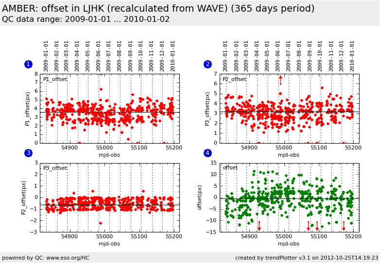
| Plot 1 | | data source: | local text file
|
| dataset: | P1_offset | • |
| median: | 3.56 | NONE |
| thresholds: | none | |
| N_data plotted: | 617 |
| [click on plot for closeup] |
| Plot 2 | | data source: | local text file
|
| dataset: | P2_offset | • |
| median: | 3.17 | NONE |
| thresholds: | none | |
| N_data plotted: | 617 |
| [click on plot for closeup] |
| Plot 3 | | data source: | local text file
|
| dataset: | P3_offset | • |
| median: | -0.64 | NONE |
| thresholds: | none | |
| N_data plotted: | 617 |
| [click on plot for closeup] |
| Plot 4 | | data source: | local text file
|
| dataset: | P3_offset | • |
| median: | -0.371 | NONE |
| thresholds: | none | |
| N_data plotted: | 617 |
| [click on plot for closeup] |
These plots show the offsets between P1/P2/P3 and the interferometric channel.
The values in the plots marked as "from header" (black dots) are retrieved from the headers of the P2VM HIERARCH ESO Px OFFSET (they are calculated by the instrument)
The values in the plots marked as "recalculated" (red dots and green dots) are recalculated on the WAVE raw files using the pipeline (red dots) or Antoine Merand's python script (green dots)
General information
Click on any of the plots to see a close-up version.
The latest date is indicated on top of the plot, data points belonging to that date are specially marked.
If configured,
- statistical averages are indicated by a solid line, and thresholds by broken lines
- outliers are marked by a red asterisk. They are defined as data points outside the
threshold lines
- "aliens" (= data points outside the plot Y limits) are marked by a red arrow (↑ or ↓)
- you can download the data for each parameter set if the 'Data downloads' link shows up
|